 Jul 19, 2025
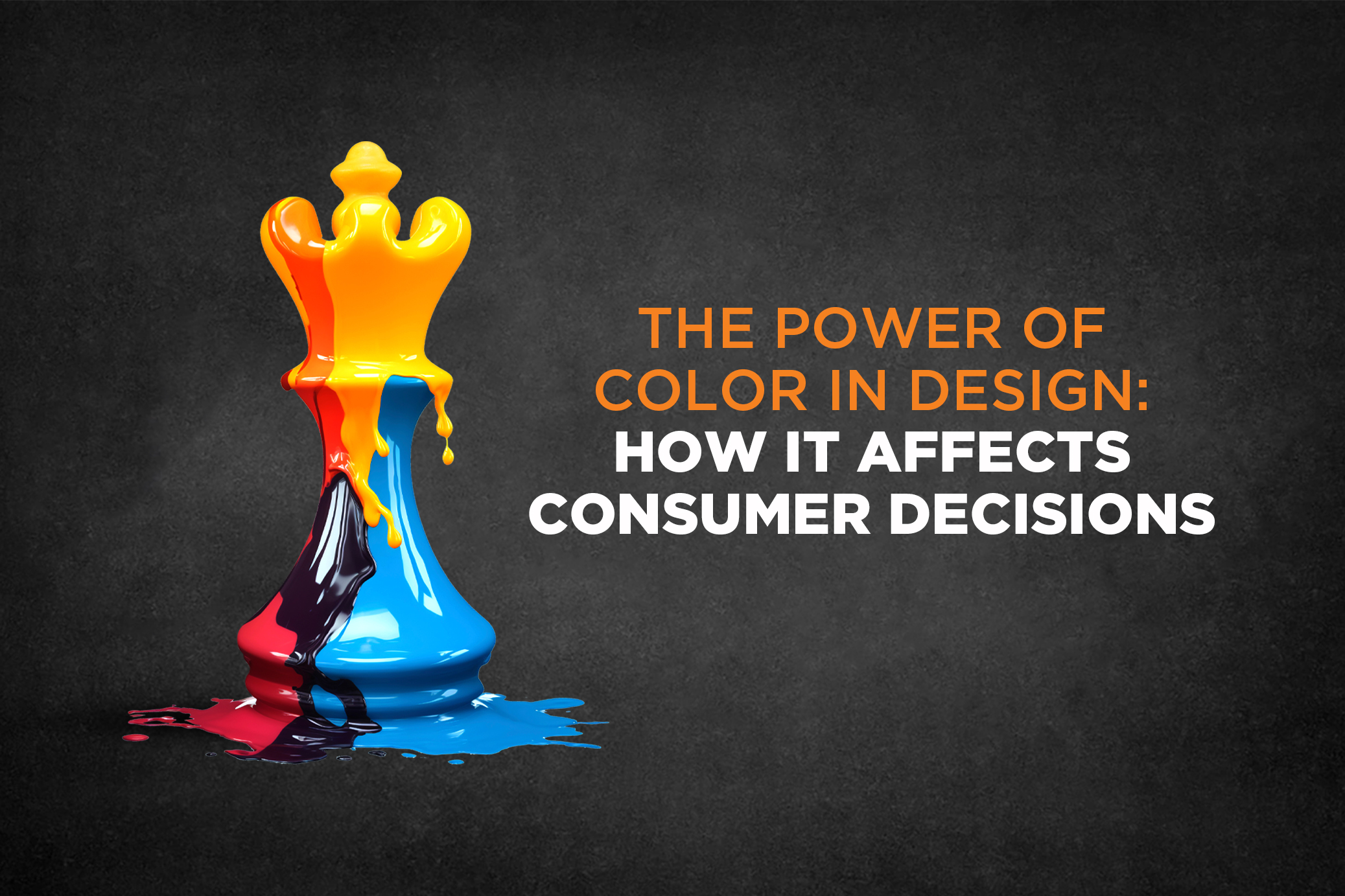
The Power of Color in Design: How It Affects Consumer Decisions
From the logo on a storefront to the scroll-stopping tone of a digital ad, color is often the first thing your audience notices—and the last thing they remember. But color doesn’t just attract attention; it shapes perception, evokes emotion, and subtly guides consumer decisions.
In branding, marketing, and advertising, understanding the psychology of color isn’t just helpful—it’s critical. Here’s how making smarter color choices can directly influence customer behavior and improve your brand’s performance.
First Impressions Are Built on Color
Studies reveal that people form a first impression about a product or brand within just 90 seconds—and up to 90% of that judgment is based on color alone.
That means before a word of your ad copy is read or a single product feature is understood, your brand color has already spoken. Choosing the right palette can set the tone for trust, credibility, and curiosity.
Different Colors Evoke Different Emotions
Each color carries an emotional and psychological association. When used strategically, colors can reinforce your brand personality and influence purchase decisions:
Red – urgency, energy, passion (used in sales banners, fast food, and sports brands)
Blue – trust, calm, professionalism (common in finance, healthcare, tech)
Yellow – optimism, youthfulness, energy (great for call-to-actions and kids’ products)
Green – nature, health, balance (preferred by eco-friendly and wellness brands)
Black – luxury, authority, elegance (used by high-end fashion and lifestyle labels)
But context is key—red can signify danger in one context and power in another.
👉 Explore more on how emotions impact buying behavior in our blog: The Marketing Science Behind Customer Emotion
Consistent Color Builds Strong Brand Recognition
Think Coca-Cola red, Facebook blue, or McDonald’s yellow—these iconic colors aren’t accidental. A consistent color scheme can boost brand recognition by up to 80%.
Pro tip: Define your brand’s primary and secondary color palette and apply it consistently across all marketing touchpoints—ads, packaging, websites, social media, and print.
Color Can Influence Purchase Intent
Color isn’t just aesthetic—it’s a conversion tool. When used right, it can directly affect click-through rates, signups, and purchases:
Red CTA buttons often increase urgency and clicks.
Black & gold can elevate the perceived value of luxury items.
Soft blues/greens instill trust in service-based or healthcare offerings.
The right color combination can guide your audience from awareness to action.
Culture & Context Matter
Color meanings aren’t universal. For instance:
White symbolizes purity in Western cultures, but mourning in parts of Asia.
Green generally signals positivity, but can mean something different based on local customs.
Great design is always audience-centric. Make sure your color choices align with your target market’s cultural context and expectations.
Accessible Design = Smarter Design
Design isn’t just about visuals—it’s about experience. Consider accessibility when choosing colors:
Avoid relying solely on red/green combinations.
Ensure sufficient contrast for readability.
Use icons or labels alongside color cues for clarity.
Accessibility builds inclusivity—and inclusive design builds trust and brand equity.
Color Is Not Decoration—It’s Strategy
At its best, color is not a design choice—it’s a business decision. It strengthens your brand identity, enhances emotional impact, and nudges your customers toward action.
By being intentional with your brand’s color palette, you can:
Improve customer recall
Boost ad performance
Reinforce brand emotion
Drive higher conversions
Build with Purpose. Design That Speaks.
At Canonfire Creatives, we blend powerful storytelling with strategic design. From defining your brand’s color system to building high-impact campaigns, we help businesses like yours turn design psychology into measurable growth.
Need help identifying the right color tone for your brand’s audience and goals?
Let’s talk.
Contact us at canonfirecreatives.com and create designs that do more than look good—they perform.